One of the most hated Photoshop features is its color selector (hence why there are so many paid extensions that change its behaviour: MagicPicker, Coolorus...). The square color selector may have some sense for photographers, but it is a no-no for artists. Why? In the square version, if you choose a colour and select left or right from it, you are not maintaining the same value.
In Painter's color selector you can trust (and in the forementioned extensions developed for PS): if you select a colour you can move around knowing how the value is going to change.
I think Paintstorm, focused on artists, should have a triangular style color selector, or at least letting you choose (maybe it is already there and I don't know how to activate it?)
Tirangular color selector
Re: Tirangular color selector
I hope it's been realized in the next to weeks, but it's not 100%...
Re: Tirangular color selector
Actually Photoshop color selector is hated because you have to open window each time you want to use it 
I actually like square picker, even if I would like to have triangle one too, and circle one, ability to change modes and so on...
like for example in krita
http://blog.cberger.net/2010/12/04/krit ... -selector/

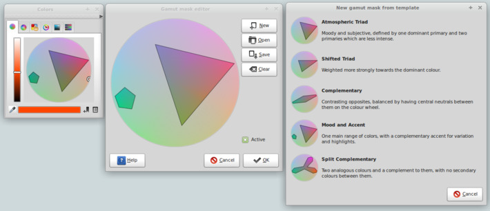
and also color picker masks like in developement version of MyPaint

I actually like square picker, even if I would like to have triangle one too, and circle one, ability to change modes and so on...
like for example in krita
http://blog.cberger.net/2010/12/04/krit ... -selector/

and also color picker masks like in developement version of MyPaint

Re: Tirangular color selector
Maybe at first we add simple triangle and hsb rgb sliders, and later add more variations.
